United Abolitionists
Globally Ready Brand System and Design Toolkit
💡 Brand System Design | Global Accessibility Design | Visual Identity | Typography & Color Strategy | Information Design | Cross-Cultural Communication | Layout & Composition | Design Toolkit Development
🛠️ Figma | Illustrator | Photoshop | Accessibility-First Typography) | UI–Color Palette | Google Workspace | Asset Export Tools
👥 Founder | Colleagues
Brand Strategy
The United Abolitionists brand system was designed to be globally deployable, trauma-informed, and accessibility-first. I built the visual identity around Noto Sans, a highly readable, open-source typeface that supports over 100 writing systems, ensuring international adaptability across awareness, training, and crisis-response contexts.
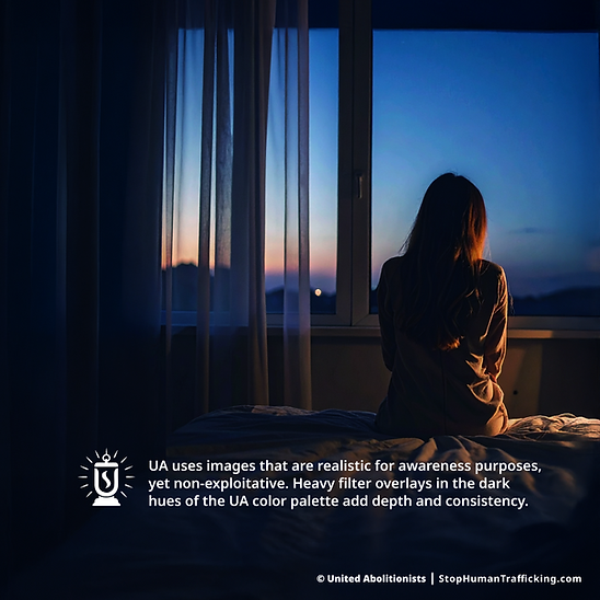
The expanded color system uses Carmine UI accessibility palettes, tested for contrast and readability in low-light and mobile conditions—an essential requirement for emergency-use environments. I developed a unified icon style, badge system, QR-enabled outreach materials, and guidelines for image selection that avoid exploitation while maintaining realism.

BEFORE
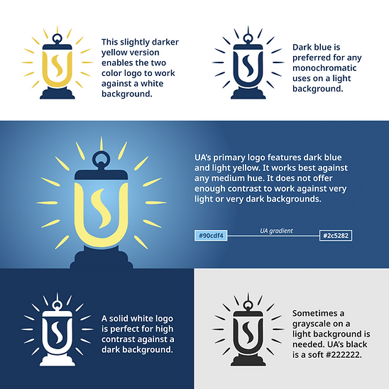
The original brand was high contrast and bold. I leaned into existing decisions like general color choice, but I softened the brand with a gradient and more sophisticated palette. I also reworked the logo for better balance.


